The Bluest of Them All: Exploring the Visual Design of Megamind
Superheroes are a staple of American culture, following the adventures of men and women in tights who use their superhuman gifts to defeat villains that terrorize their hometown. However, one question has been commonly wondered by readers and viewers alike: What happens when the hero loses and the bad guy wins?
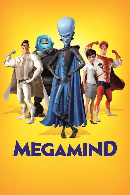
Fig. 1 - Megamind (Tom McGrath, 2010).
The 2010 animated film Megamind, directed by Tom McGrath (Fig. 1), may just have the most disruptive yet meaningful answer to this hypothetical. As the titular supervillain wins a battle against Metro City’s caped saviour after decades of failed attempts, everything else about the city seems to fall apart on its own after its core narrative event has been rewritten, and DreamWorks retorts with an even deeper question: what if the bad guy was never the bad guy at all? Throughout the film, Megamind silently forces the true identities of heroes and villains to shine through using visual motifs and elements of colour, making the statement that sometimes the labels or roles people are forced into do not reflect who they really are.
The story begins when two superpowered orphan infants, whose home planets have been destroyed, seek asylum on Earth. While one’s spaceship is smoothly delivered to a mansion, the other crash-lands in a prison facility. The former grows up into Metro Man (Brad Pitt), Metro City’s idolized equivalent of Superman. The latter takes on the name of Megamind (Will Ferrell), using his outstanding intellect to become the city’s resident chaotic supervillain. The rivalry between the two falls into a rhythm lasting over 20 years, where battles always end with Megamind thrown into prison (although later escaping). This is completely transformed when Megamind wins a fight for the first time, reducing Metro Man to a pile of bones and dust. Though his victory is celebrated—much to the horror of Metro City’s residents—he later begins to question his purpose as a supervillain if not to fight a superhero. Lost and desperate, he tries to build his own hero to replace Metro Man, but unexpectedly learns the foundations of what makes a hero and what makes a villain at all.
Before the story is examined, the colour schemes help to narrativise the main characters and their personalities. Comic book superheroes are known to sport brightly coloured palettes, which make them more easily recognizable, and in different contexts these colours represent certain aspects of their character. We start off with Megamind’s defining hue: an electric shade of sky blue. The colour blue can take on several meanings, but in a surprising twist many of them are positive. According to Naz Kaya and Helen H. Epps, blue can make an area feel more spacious and express restfulness, and is often associated with more positive emotions (2004, 397). Why, then, would DreamWorks choose this as the main colour for a destructive supervillain? In a 2004 college study, Kaya and Epps found that “The negative emotions for the color blue were sadness, depression, and loneliness” (2004, 399). In the context of the film, this makes perfect sense: blue is not inherently a villainous colour, but here it tells the audience visually that Megamind’s actions and career path are driven not by a desire to be evil, but rather by his ostracization and isolation from the rest of the world. This may seem obvious at first, especially with the titular protagonist proudly stating, “Then, it hit me. If I was going to be the bad boy, I was going to be the baddest boy of them all!”. However, the disparity between Megamind’s excitement and the character’s lonely blue colour tell us that his epiphany is no epiphany at all, but rather a coping mechanism for the way the world already treats him.
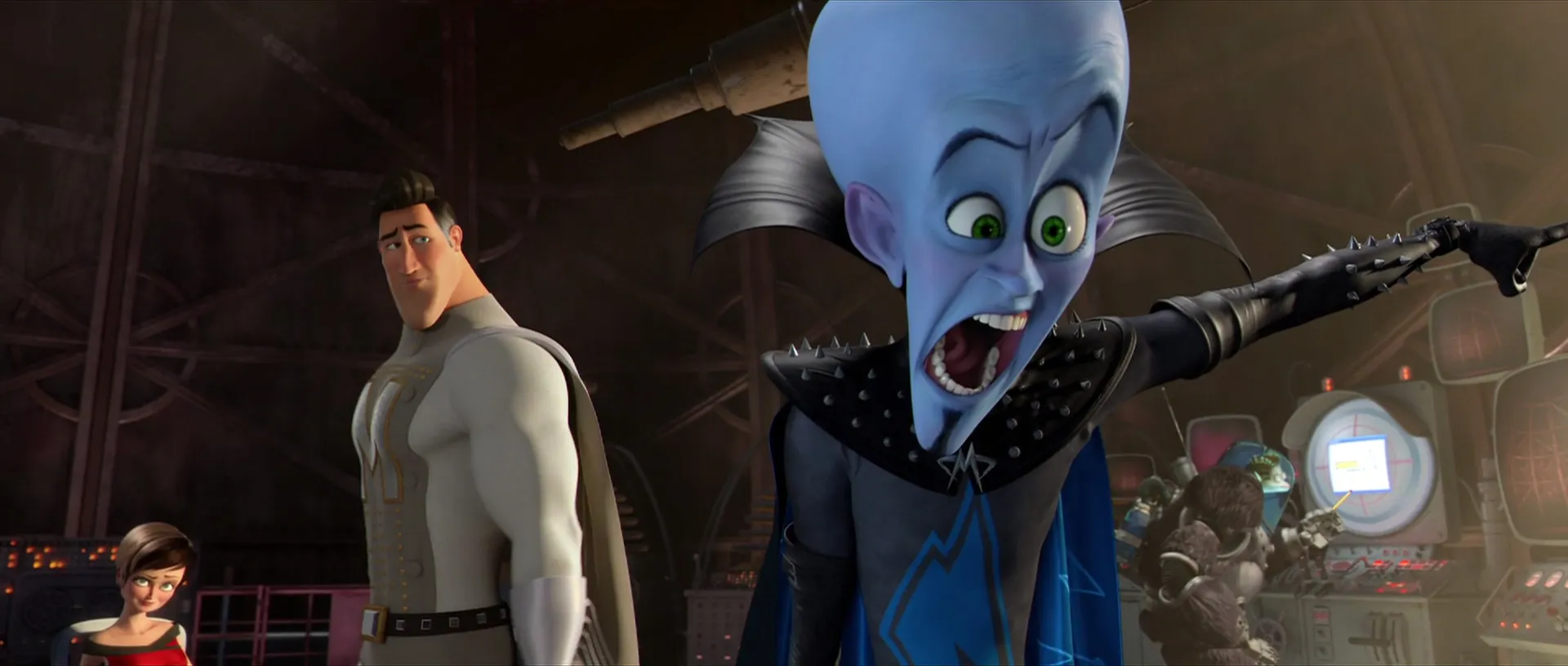
Fig. 2 - The contrasting costuming of Metro Man and Megamind.
In an effort to conceal this loneliness, Megamind shrouds himself in unfeeling darkness, often wearing the colour black. In addition to black being “seen to evoke negative emotions such as sadness, depression, fear, and anger,” which correlates with the way blue is being used in the film, in the 2004 study it “also was connected with darkness and night time… […] …richness, wealth, and power” (Kaya & Epps 2004, 400). Whenever Megamind is in his true form, he wears a full-body suit in black leather spandex, with nothing exposed under the neck. This is in addition to impressively spiked shoulder pads and a long cape that is black on the outside. He quite literally covers himself in a symbol of power as a shield from the world, to appear menacing and play the role of the terrifying “bad guy”—which, as a reminder, is a role society has given to him instead of the place he truly belongs. This in itself is seen through the evolution of his costumes in the film. The first clothing he wears as a baby is a blue jumper, symbolising his innocence which has not yet been tainted. Then comes the orange prison jumpsuit, a loud reminder of his upbringing. It is not until he becomes an adult where he is seen wearing black, signifying he has grown into the role in which he was forced to reside.
After Megamind’s design has been established, those of his rivals tightly revolve around it. Metro Man, his opposite, is constantly bathed in gold and white (Fig. 2). White has a positive association with peace, hope, and purity (Kaya & Epps 2004, 399), while gold is a rare metal and an international symbol of rarity, status, and luxury. Much like Megamind cloaks himself in black (Fig. 3), the white and gold palette that Metro Man wears is a reflection of what others think of him, rather than an indicator of his personality. To cement this idea early on, DreamWorks has the teacher in their elementary schoolhouse place several gold star stickers on his shirt as a badge of honor: something he accepts proudly, but still not something of his own creation. It is also worth noting that while Megamind’s palette morphs and adapts to his perception of the world over time, Metro Man wears the same white and gold throughout the entire film like a heavy crown.
In the same strain, there are too many parallels that can be made between Metro Man and Megamind. For one, they have the same number of syllables in their name as well as the same initials, M.M, almost like a matching pair. Bright yellow is opposite to deep blue on the colour wheel, while black is opposite to white. Metro Man always appears in bright sunlight or spotlights, while Megamind initially carries out his evil schemes in the middle of a dark cloud on Metro Man Day and at night during his citywide takeover. They fit perfectly as each others’ opposites, as foils—not truly as enemies, but as pieces of a comic book narrative that was carefully crafted to contain them. This solidifies the idea that the narrative happens not as a reflection of their true selves, but solely what it is on the surface level: an episodic back-and-forth with every issue beginning with an evil scheme and ending with the villain behind bars.
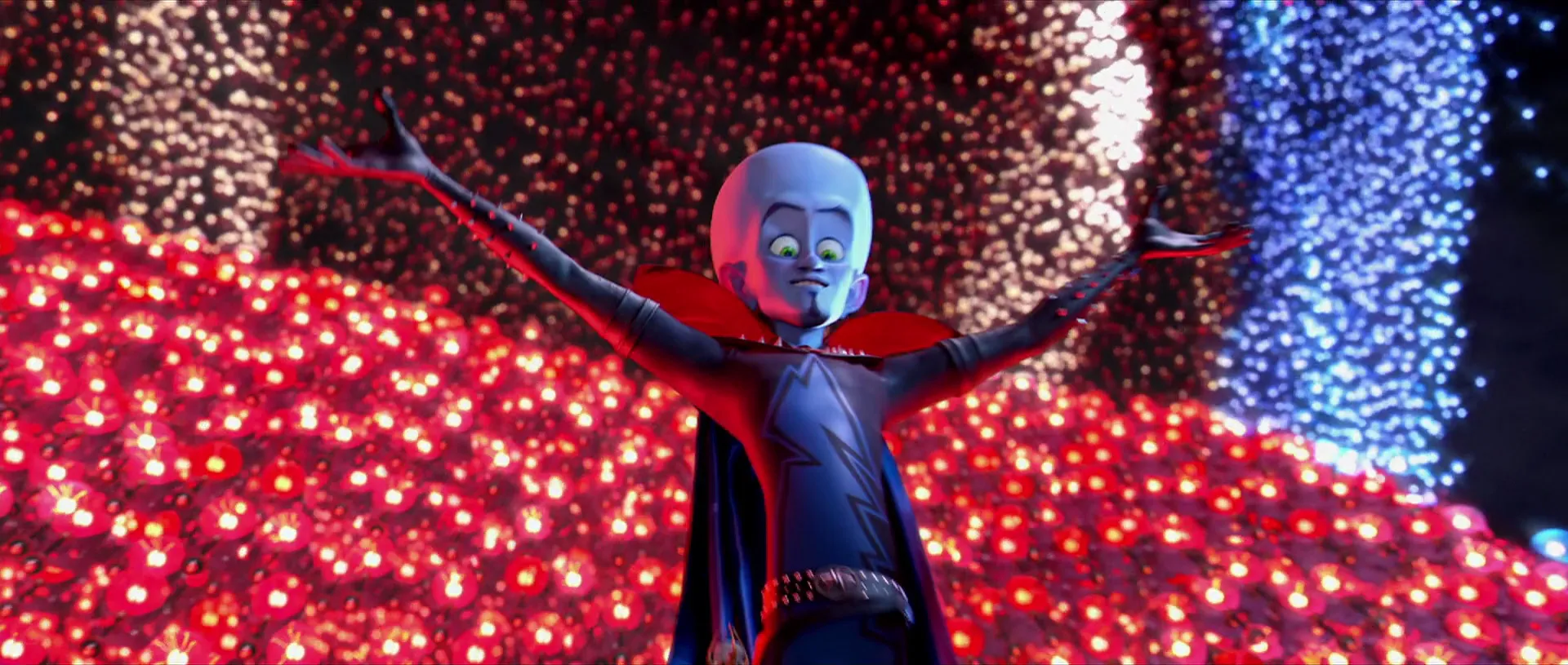
Fig. 3 - The eponymous Megamind.
After Metro Man is defeated, the hole he leaves is devastating to the public. Megamind, also distraught, quickly tries to find someone to fill that hole and fails miserably. Enter Hal Stewart, also known as Titan (Jonah Hill)—or “Tighten,” as he misspells it—the nerdy, awkward cameraman for news reporter and love interest Roxanne Ritchi (Tina Fey) who holds the belief that the world owes him itself. Before Hal gains his powers, he often wears dull shades of green and grey, which end with him blending into the crowd and feeling ignored. As he obtains his suit and identity as Titan, he gains a level of personal freedom and confidence which he lacked before. In comparison to Metro Man’s calm, steady gold, the harsh, bright red and orange flames on Titan’s suit are symbolic of aggressiveness, destruction, and the pent-up anger he later feels towards Roxanne. Like Metro Man, the base of his suit is white, but in the place of the golden M is wildfire in the shape of a T—almost as if it is burning away everything Metro Man stood for while taking his place. This is a precursor and visual complement to the actions he later takes, such as endangering Roxanne in an attempt to woo her, stealing property just because he can, and nearly killing Megamind on the spot.
The obvious lack of Metro Man and the juxtaposition with a much more violent and terrifying villain do something fascinating to Megamind’s design: they make the blue in his colour scheme stand out even further. No longer is he the baddest bad guy in town, but his electric blue turns from being a dark stormcloud earlier to representing a literal beacon of light in the darkness which shines in Roxanne’s eyes. It is at this exact moment that Megamind starts to embody blue’s more fitting and well-known association of hope. His colour palette was designed to be transformative with context, adapting as he finally becomes the hero and saviour he was always meant to be.
Throughout DreamWorks’ film, colour is used repeatedly to expose characters’ motives and inner turmoil, which purposefully clash with the roles in which they are placed. Megamind is not a true villain; his actions are the product of his upbringing. Titan is less a hero and more a ticking time bomb of entitlement and rage. This film leaves much to say, but the vital takeaway is that whatever destiny we are roped into or choose to follow, our true selves and intentions are what guide how our stories are written.
**Article published: January 30, 2026**
References
Kaya, Naz, and Helen H. Epps. 2004. “Relationship between Color and Emotion: A Study of College Students.” College Student Journal 38, no. 3: 396–405.
Biography
Cristina Kovacs is a student at the University of Texas at Dallas, Harry W. Bass Jr. School of Arts, Humanities, and Technology. She has a concentration in visual development and character design, with a strong passion for inspiring joy and emotional connection through the art of animation. Earlier versions of this text were developed with the help of Amy Grieshaber, Assistant Professor of Instruction and peers from the Animation Studies course.